Welcome to a new phase in your career: One where you realize you are so much more than a print designer. You're a Designer who solves problems across various platforms.
I'm so pleased to be a part of a conference that provides a solution to the #1 concern from print designers: "I need to learn interactive design to keep my job/attract new clients/secure my future in the industry, but I have no idea where to begin."
Technology moves so fast that, like you, I feel as though I'm always trying to keep up. The good news is that even as technology advances, the principles you will learn at HOW Interactive Design Conference will remain valuable and relevant.
At HOW Interactive Design Conference, you'll learn the most important concepts to consider when designing for the web, mobile devices and more. And this year we've split the program into two tracks, so it's even easier to target the specific information you need.
One track will be geared toward designers just moving into web design, with sessions on transitioning your print design skills and getting comfortable with SEO, structuring information, and working across multiple mediums.
The other track will help you ratchet your current digital design skills up a notch with the latest information on programs, technologies and trends.
Don't miss this opportunity to spend three days networking with your fellow designers and learning directly from the most respected, friendly and accessible interactive designers in the industry.
I hope to see you in San Francisco!
Bridgid McCarren
HOW Interactive Design Conference Program Chair
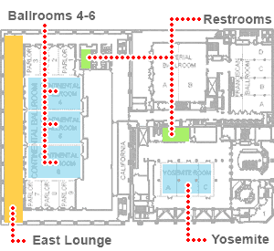
Registration opens at 7am at the East Lounge Foyer of the Hilton San Francisco Union Square Hotel. Sessions will be held in Continental Ballroom 4-6 and Breakouts will be in Yosemite.
Hilton San Francisco Union Square
Ballroom Level
Visit the sponsors
Take a few moments and visit our sponsors. They are located in the East Lounge Foyer.
Build a Solid Network of Interactive Designers.
At the HOW Interactive Design Conference, you'll meet industry leaders who are determined to help you develop and expand your web design prowess. They'll explain the technologies and trends that are shaping the future of design, and make sure you have all the interactive design skills to thrive in this fast-paced and constantly changing field.
In addition to the speakers, you'll also meet a talented bunch of designers who are, like you, looking to stay current on interactive design. Make sure you give—and take—a lot of business cards. These folks could be a valuable resource for advice, solutions and even collaborative help long after the conference is over.
Check out this designer's guide to San Francisco from the HOW Interactive Design staff.
Hilton San Francisco Union Square
333 O'Farrell Street (at Mason Street)
San Francisco, CA 94102
Your home base for the conference is conveniently located in the heart of San Francisco (and just around the corner from last year's location). The Powell Street BART station can get you pretty much anywhere in the city, and there are plenty of buses going down Market Street (see this map from SFMTA to get an idea of your options).
Visit the sponsors
Take a few moments and visit our sponsors. They are located in the East Lounge Foyer.
Restrooms
Restrooms are located...
Join us Tuesday from 8am-8:50am for breakfast roundtables in Continental 4-6 Ballrooms. It's your chance to sit down with your favorite speakers for intimate discussions about their sessions or to ask questions!
Don't forget to visit the sponsors
SponsorsJoin us Wednesday from 8:30am-9:30am for a second round of breakfast roundtabltes in Continental 4-6 Ballrooms. Enjoy coffee and a continental breakfast with your speakers and peers attending the conference!
Don't forget to visit the sponsors
SponsorsClosing Reception will be held in the East Lounge Foyer. Join us for light hors d'oeuvres and cocktails and network!
Hilton San Francisco Union Square
Ballroom Level
Join Patrick McNeil, Creator, DesignMeltdown.com, David Sherwin, Principal Designer, frog, and Karen McGrane, Managing Partner, Bond Art + Science for an expert panel discussion based on your feedback!
Please post your questions for the panel discussion to #HOWIDC
Patrick McNeilJoin Cameron Moll, Founder, Authentic Jobs, Chris Butler, Vice President, Newfangled, and industry expert Suzanne Ginsburg for an expert panel discussion based on your feedback!
Please post your questions for the panel discussion to #HOWIDC
Cameron MollYou have no sessions selected for your favorites.
Sunday, October 28 1:00am - 4:00pm
Whether you're in-house or on your own, a small firm or a freelancer, when it comes to getting and doing interactive work, it's a whole new world. Projects are more complicated, clients are more anxious and the projects seem to never end.
This new "business bootcamp" will help you position your services to attract the right interactive clients and create proposals that are profitable for you and them.
In this hands-on, half day session, you will:
Monday, October 29 8:45am - 9:15am
Why You are Here and How to Get the Most Out of this Awesome Conference!
Monday, October 29 9:20am - 10:20am
Learn how to create adaptive content so you can survive the onslaught of new mobile devices, platforms, and screen sizes—hordes of them!—that are descending on us every day.
Karen McGrane will help you separate your content from its form, so it can adapt appropriately to different contexts and constraints. You'll learn how to change your production workflow so you're not just transferring content from one output to another. And you'll learn the importance of enhancing your content management tools and interfaces so they're ready for the future.
Monday, October 29 10:35am - 11:25am
Learn how to pick the right tool for the job, when the tools (and sometimes the jobs) are constantly evolving. From desktop design and development tools to online/mobile solutions for building and managing interactive projects, the purpose of this session is to identify real world solutions and tools for interactive designers and design teams.
Matthew Richmond will take a look at creative design tools, wireframing/prototyping tools, site building and content management solutions as well as project management and communication tools, focusing on solid solutions and establishing a clear path so you know what you should be focusing on next.
Monday, October 29 10:35am - 11:25am
Jesse Friedman, Director of Web Interface and Development, Astonish Results.
Monday, October 29 11:30am - 12:15pm
Discover tools you can use to gain a deeper understanding of your audience's needs, and learn how to incorporate what you've discovered into their design work as frog's David Sherwin explains the importance of knowing your audience.
Gaps in knowledge about your user's needs are what most often cause a website or application to fail to meet a user's expectations. In this talk, David will demystify the role and use of research in the day-to-day work of an interactive designer. He'll draw on his own experience as a design research lead for frog, where he helps coordinate teams in conducting U.S.-based and global research programs. You'll walk away with a list of resources you can draw from to begin practicing specific research methods and tools. You'll also learn how to sell the value of research to your client's boss's boss—it's not as hard as it looks!
Monday, October 29 11:30am - 12:15pm
Get a fun, but in-depth look at Wordpress theming with Jesse Friedman. He'll teach you how to turn static websites into dynamic Wordpress powered themes, using specific code, best practices, and strategies. By the end of the session, you'll have a basic understanding of Wordpress—plus all the resources necessary to continue your education on your own.
Monday, October 29 1:30pm - 2:30pm
When web designers start a new project, one of the first challenges they face is how to organize the site. What content needs to be accommodated? What information is primary, and what's secondary? What should the navigation consist of?
In this session, Brian Miller will give you a detailed look at information architecture (and help you answer all those questions). He'll take you through site map planning, wireframes, information hierarchy, and more. You'll learn how to think about the elements of a Web page—headers and footers, sidebars and features...everything that contributes to how intuitive a site is to use and navigate. You'll see what works and why—and also learn what to avoid. You'll walk away with the ability to put yourself in the user's shoes, and to think like an information architect.
Monday, October 29 2:35pm - 3:35pm
Join Patrick McNeil as he digs into web hosting, DNS, domain names and all the technology required to host a web site—because knowing how site hosting works is one of the most basic elements of working on the web.
Lack of understanding can be a point of frustration for designers and clients as well, but having a little knowledge can help you engage your technical team, solve very simple (but real) problems for clients and really better understand how the web works.
And don't worry, this designer friendly presentation will focus on the practical application of these principles.
Monday, October 29 2:35pm - 3:35pm
For years, designers and developers have griped about the difficulties they encountered in supporting the numerous desktop browsers out there, but mobile is even more fragmented. Phones, tablets, media players, video game systems—each device (and in some cases each browser on each device) has its own dimensions, quirks and capabilities. It can make your brain hurt just thinking about it.
Thankfully, going mobile doesn't have to be a painful experience. In this session, Aaron Gustafson will introduce you to the concept of progressive enhancement and demonstrate why it is the way forward for web design, especially on mobile devices. In the course of his talk, he'll walk you through progressive enhancement's layered approach and show you how the latest techniques—mobile first, responsive design, and adaptive UI—fit in to the process. Along the way, he'll show you tons of examples and give you lots of great ideas you can put to use in your own projects.
Monday, October 29 3:50pm - 4:35pm
So you know what web fonts are and how to make them load in your websites. Now What? Join design professor Laura Franz as she shares techniques for finding, testing, and using web fonts. You'll learn how to determine what font provider is best for you and your client, if a web font works well cross browser, and what web fonts others are using. You'll even learn tricks for using web fonts, such as how to avoid faux bold and italic on your site, updated rules of typography to improve readability on screen, and what to look for in a fallback font.
Monday, October 29 3:50pm - 4:35pm
Join Chris Converse as he explores (and explains) the more advanced concepts in Responsive Web Design by adding in Responsive Web Experiences. By incorporating jQuery into your design, you can take more control over the user experience of a site, and even change the experience based on the user's screen size—just as you do with layout and style. You'll even learn how to alter input behaviors by switching mouse events to touch when on touch-enabled devices, leading to a truly customized experience for each user.
Tuesday, October 30 9:00am - 10:00am
Feedback is essential. Without it, there is no way to know if what we've created is actually useful. When it comes to interactive design, the best feedback systems follow a simple pattern: Questions > Answers > Action. In this session, you'll learn how to make sense of the data available to you, whether it comes from analytics tools or users themselves, and use it to improve your designs.
Tuesday, October 30 10:00am - 11:00am
Success in today's roller coaster economy is tied to connection. On all levels. Products and services must connect with customers in a meaningful way. But translating fuzzy feelings into user experience design is tricky.
Design ethnographer Kelly Goto presents contextual personas—a proven method for mapping experience to emotion—to turn contextual research into usable insights and recommendations. By capturing information about goals and environment alongside emotional indicators, we gain insight into designing user experiences that connect to people's real needs and desires.
Tuesday, October 30 11:15am - 11:45am
Learn what makes effective designs successful and how to avoid common discoverability pitfalls. Traditional user interface design is conservative—on-screen elements such as buttons and the like leave little to chance. But design innovation is risky: high upside, high downside. It's hit or miss. A hit—an intuitive design element or gesture right where you expect it to be—can delight a user. But a miss—a rewarding feature not found—is a wasted opportunity that results in a frustrated user. Aesthetics and real estate constraints heighten the importance of simplicity and clean lines, but how much can you afford to take away? How can you reduce the physical presence of elements without sacrificing their discoverability? Everything should be made as simple as possible, but no simpler. This talk will introduce a range of discoverability strategies to help you create solutions in this new interface world. After this talk, you'll be able to extend these strategies and best practices to your own applications.
Tuesday, October 30 11:15am - 11:45am
Learn how to effectively approach a digital ad campaign and discover best practices for driving engagement to connect with our audiences. From cutting-edge rich-media ads and viral videos to Facebook apps and site-wide takeovers, Kam Diba will help you ensure that your creative executions are engaging enough to increase brand awareness.
Beginning with brainstorming and going all the way through final execution, we'll cover the basics of media strategy, design and messaging to get your campaign noticed.
Tuesday, October 30 11:50am - 12:20pm
With more than 500,000 apps available to consumers, 2012 has been labeled the year of the app. But as you consider your mobile strategy it is legitimate to ask "Do I need an app for that?" This session will use case studies to explore the contexts in which an app is the right solution and also highlight the situations in which other mobile web solutions are the right choice for your users.
You'll learn
Tuesday, October 30 11:50am - 12:20pm
With the use of mobile and tablet growing everyday we get to explore different opportunities online and offline, apps and new paradigms of delivering content. This presentation focuses on how different audiences interact differently with each devices. With a focus on giving you the tools to choose the right medium to create your experience.
Tuesday, October 30 1:30pm - 2:30pm
Knowing how to create teams that can design, iterate, build, and get to the finish line as soon as possible is one of the most challenging things to figure out in our industry. Over the course of an hour, Cameron Moll will show you how to work internally on interactive projects through various team scenarios, such as:
Tuesday, October 30 2:35pm - 3:05pm
The competitive analysis is crucial to research in branding, website and product design. If done right, it should lead to insight about the landscape that generates ideas on how to solve visual and UX problems.
To make sure your analysis is on the right track, Stuart Silverstein will showcase different types of competitive analysis available to visual and UX designers, explain the techniques for documentation, as well as help you see what insights you should look for in each type of analysis. Finally, he'll look at how your analysis should influence design decisions and help you create a better product.
Tuesday, October 30 2:35pm - 3:05pm
Perfect for project managers and leads, digital strategists, designers and developers, this session will give you an overview of the difference between being consultative and collaborative, with concrete examples of how to handle even the most complex interactive design/development projects.
Using her own experiences working on large website design/development projects with multiple stakeholders, Emira Mears will teach you how to involve and educate clients in ways that keep projects on time and on budget—and leaves a trail of satisfied clients behind you.
Tuesday, October 30 3:20pm - 3:50pm
In web design, like print design, it takes a while to develop an effective creative process—hours of pushing pixels and creating idealized designs (that the client doesn't sign off on), making revisions, racking up hours, making more revisions. But eventually, you'll learn how to make it all work.
That's the story Josh Goldblum will share in this session: lessons from deep in the trenches, hard-earned bits of wisdom forged from a range of disastrous mistakes in process and execution. Teaching from his—and others'—mistakes and successes, he'll help you firm up your own web design process, from nailing down the structure, to addressing content, navigation and hierarchy, to starting the actual design.
You'll learn how to:
Tuesday, October 30 3:20pm - 3:50pm
In this session, Paul Boag will explain how he took one ecommerce website from relatively successful beginnings to unbelievable heights. In only 5 years he and the team at Headscape increased sales on the site by a staggering 10,000%. What makes the story even more unbelievable is that the average customer is over 80 years old! This single example will act as a case study that guides you towards better understanding your audience and growing your online sales significantly.
You'll learn:
Tuesday, October 30 3:55pm - 4:25pm
There could be a little more green in your wallet soon – if you have the skills hiring managers are looking for. Based on research for The Creative Group 2013 Salary Guide, this session will provide a glimpse of the hiring landscape and compensation trends for creative professionals in the coming year. Donna will share the most requested digital skills among employers and highlight salary data for a number of in-demand interactive positions – information that is critical for improving your overall marketability.
Wednesday, October 31 9:30am - 10:30am
The web is not a fixed width. So if the medium is fluid, should the process be fixed? Open source evangelist Steve Fisher prefers designing within the browser, especially when responsive design is a requirement since Fireworks and Photoshop are not flexible enough to demonstrate media queries, button and menu states, HTML5 and JavaScript behaviors, dynamic resizing of elements and navigation flow.
Learn how to develop a fluid process to match the fluidity of interactive design as Steve shows you why a responsive process is a responsible process. He'll explore some of his recent work helping clients transform their processes to fit a responsive workflow and share some of the tips, techniques and processes he's developed. One web to rule them all!
Wednesday, October 31 10:35am - 11:35am
Is your website a simple brochure or is it a business-generating machine? If it's not constantly attracting, informing, and engaging your prospects you're sitting on an asset that is not serving your business as well as it could—and should—be.
During this session Mark O'Brien will explain how you can transform your online brochure into a tool that will be the centerpiece of your firm's marketing strategy, helping you gain new business, maintain relationships with current clients, and more.
Wednesday, October 31 1:00pm - 4:00pm
Creative Cloud gives you full access to everything in CS6, as well as new technologies such as Adobe® Muse™ and Digital Publishing Suite Single Edition. See how to put it all to use in this 3 hour workshop that will introduce you to two new technologies within the Creative Cloud that make designing digital experiences as easy as designing for print:
Wednesday, October 31 1:00pm - 4:00pm
Learn how to use various web-authoring strategies to create responsive web design as Chris Converse explains the nuts and bolts (and even provides a template to get you started!).
In it's simplest form, CSS3 media queries allow us to manipulate elements of our page to fit multiple screen sizes. This alone can be enough to implement your web content to a broad array of users. But when we combine features of CSS, such as absolute positioning and background images, with alternate HTML markup techniques, we can begin to alter the user experience in addition to layout. Using HTML elements as 'containers' for imagery allows us to use alternate imagery based on the user's screen size, decreasing download speeds on mobile devices. In addition, re-positioning elements gives to the ability re-order the appearance of elements, instead of simply resizing them.
When we add AJAX into the mix, we can begin to load advanced user experiences into our web pages. Adding JavaScript detections to our web pages allows us to load more engaging experiences, while maintaining the advantages of optimized user experiences. What's more, the experience we load can be adapted to the device viewing the web page, such as mobile web experience framework.
Want to try it for yourself? Chris will be providing a free template to HOW Interactive Design Conference attendees!
Requires additional fee of $149.
Get Social
Follow us online
Social Media
Facebook Twitter @HOWInteractive Twitter #HOWIDC PinterestOverheard at HIDC 2011
HOW Interactive Design Conference
San Francisco 2012
© 2012 F+W Media.
Designed and developed by
Cōdify Design Studio